Designers dive into a world of typography, where each font has its own vibe. Comic Sans is a standout, loved by many and hated by some. It’s a casual, playful font that has found a home in the hearts of casual users and the frustration of design pros1.
In 1994, Microsoft designer Vincent Connare created Comic Sans for casual, informal use or kids’ media2. It was inspired by comic book lettering, making it friendly and approachable1. Today, Comic Sans is a well-known font, found on macOS and Windows Phone2.
Key Takeaways
- Comic Sans MS is one of the most popular fonts ever, known for its casual and informal appearance.
- The font was designed in 1994 by Vincent Connare for Microsoft, inspired by comic book lettering.
- Comic Sans MS has been widely used in various contexts, including children’s materials and informal documents.
- The font has gained both ardent supporters and harsh critics, with some professionals seeing it as unprofessional.
- Despite the controversy, Comic Sans MS is considered one of the best fonts for dyslexic users and is utilized by teachers in classrooms.
History of Comic Sans Font
Comic Sans, a font loved by some and hated by others, has a rich history. It shows how graphic design and font development have evolved3. Vincent Connare created it in 1994 for Microsoft’s Bob, a system that made computers easy for everyone to use4.
Origin and Design Inspiration
Connare, a big fan of typography, made Comic Sans inspired by comic book lettering. He was influenced by “The Dark Knight Returns” and “Watchmen.”3 He wanted a friendly font to replace Times New Roman in Microsoft Bob’s speech bubbles4.
The Role of Vincent Connare
Vincent Connare was key in making Comic Sans3. He’s said he only used it once, despite its big popularity3. This has sparked a lot of debate about its use in design.
Initial Reception and Usage
Comic Sans first appeared in Windows 95 Plus! Pack and later in OEM Windows 954. It became popular with Microsoft Publisher and Internet Explorer4. This made it easy for people to use in their work and messages4.
| Characteristic | Description |
|---|---|
| Inclusion in OS | Comic Sans is pre-installed in macOS and Windows Phone but not in Android, iOS, or Linux3. |
| Typeface Versions | Comic Sans Pro, an updated version of Comic Sans, was created in 2011 with additional features3. In 2014, a modernized version called Comic Neue was released, and in 2019, Comic Code, a monospaced version, was introduced by Tabular Type Foundry3. |
| Legibility and Readability | Comic Sans has fewer rotated and mirror-image glyphs compared to other typefaces, wider letter spacing, and is sans serif with the exception of its capital “i” having serifs3. Studies have shown that disfluency caused by using fonts slightly harder to read, such as Comic Sans, can lead to improved retention and classroom performance3. |
The story of Comic Sans is both interesting and complex. It shows how font history, graphic design, and typeface development have changed. From its start for Microsoft’s user-friendly apps to its wide use and controversy, Comic Sans continues to interest many34.
Characteristics of Comic Sans Font
Comic Sans is a font that many love and others criticize. It was made by Vincent Connare in 19945. This font has a unique look, with strokes similar to Helvetica but not as refined6. Its style, inspired by handwriting, has a tilted “e” and poor letterfit, making it hard to read in large amounts6.
Font Style and Aesthetics
Comic Sans looks casual and friendly, making it great for informal documents and kids’ materials6. But, its technical flaws, like uneven spacing and weight, make it bad for professional use6.
Common Uses in Design
Despite its flaws, Comic Sans is used in famous products like Beanie Babies and The Sims6. It was also a default font on websites like Angelfire and Geocities in the 90s6.
Psychological Impact of Comic Sans
The effect of Comic Sans on our minds is debated. Some studies say it helps us remember things better and think clearer7. Others think it’s more welcoming and less scary than formal fonts7. The weird shapes of Comic Sans might help our brains focus better7.
Comic Sans’s unique look, uses, and effects on our minds have made it a lasting topic of discussion in design.
| Alternatives to Comic Sans | Characteristics |
|---|---|
| Lexia Readable | A more legible and professional alternative with a friendly, rounded appearance. |
| P22 Kaz Pro | A casual, handwritten-style font with improved kerning and weight management. |
| FF Friday Regular | A modern, casual font with a clean and approachable design. |
“The ‘Ban Comic Sans’ movement started in 1999 by graphic designers Dave and Holly Crumbs from Indianapolis after being asked to use Comic Sans in a children’s museum exhibit.”6
The debate on font aesthetics, design psychology, and visual communication of Comic Sans goes on. Its unique traits and lasting popularity have made it a part of our culture and design world.
The Controversy Surrounding Comic Sans
Comic Sans has been criticized by many graphic designers. They say it’s overused and not right for serious stuff8. A movement called “Ban Comic Sans” started in 1999 to limit its use. Critics like Dave Gibbons call it “ugly” and “a real mess.”8
But, many people like it for its casual look and easy reading8. This has made Comic Sans a topic of strong opinions. People either love it or hate it8.
Popular Criticism in Design Communities
Graphic designers and typographers often dislike Comic Sans8. They think it’s not good for professional or formal use8. They say it looks too casual and lacks sophistication for serious documents or branding8.
Support from Casual Users
Despite the criticism, Comic Sans has fans who like its friendly vibe8. Non-designers find it easy to read and add a personal touch to their work8.
The “Love it or Hate it” Phenomenon
Comic Sans gets strong reactions, both good and bad8. Some see it as fun and informal, while others think it’s bad design8. This mix of opinions has made Comic Sans a lasting topic in design8.
“Comic Sans is a real mess, an abomination that should be outlawed nationwide.” – Dave Gibbons, graphic designer
Comic Sans in Professional Settings
Comic Sans is a common font in popular culture, but it’s often criticized in work settings9. It’s been called the most hated font and has sparked a “Ban Comic Sans” movement9. Yet, its friendly vibe has made it appear in some corporate and institutional places.
Acceptability in Corporate Communication
Using Comic Sans in business is a topic of debate10. Designers and typography fans say it lacks sophistication10. But, it has shown up in big business, like in a letter from former Trump lawyer John Dowd9. This choice led to a big discussion about its place in professional writing.
Case Studies of Notable Use
Comic Sans has also been used in a Dutch World War II memorial and a letter from NBA owner Dan Gilbert about LeBron James9. These examples show the struggle between the font’s casual look and the need for formal communication10.
Alternatives for Serious Projects
For serious projects, designers suggest using fonts like Helvetica or Garamond10. These fonts are friendly but seem more professional than Comic Sans10. Choosing the right font helps ensure messages are taken seriously and are well-presented.
The argument over Comic Sans in work continues in the design world and beyond10. As we move forward, knowing when to use Comic Sans and when to choose other fonts is key for clear and engaging business communication.
Designing with Comic Sans Font
Comic Sans is a versatile font that can be effective in design when used right11. It was first made for Microsoft Bob’s talk bubbles and later included in Windows 9511. This marked a big change in computing as Windows 95 became popular11.
As desktop publishing grew, Comic Sans became more popular. It let people design their own stuff easily11. Then, with the internet’s rise, it showed up on websites and in emails, becoming a default font for many11.
Tips for Effective Usage
Comic Sans is best for casual, informal settings. It’s good for headlines or short phrases, not for body text11. This keeps the design balanced and playful.
Pairing Comic Sans with Other Fonts
Pairing Comic Sans with serious sans-serif fonts balances informal and formal tones11. This mix is great for designs that need to be both friendly and professional11. The different styles work together to make the design more appealing and clear.
Accessibility Considerations
12Comic Sans is easy to read, which helps people with dyslexia12. The British Dyslexia Association even suggests it for dyslexia-friendly texts12. This makes the font useful in educational and accessible designs.
“Comic Sans has its own celebration day, known as Comic Sans Day, celebrated on the first Friday in July, mostly in the Netherlands.”12
When designing with Comic Sans, remember its casual and informal nature. Also, use its accessibility benefits and pair it with other fonts for a balanced and engaging design.
Comic Sans and Popular Culture
Comic Sans has become a big part of our culture. It was first seen in Windows 95, alongside Arial and Times New Roman13. Now, it’s used in emails, websites, and more, showing it’s here to stay13.
Appearances in Media and Art
Comic Sans is often seen in media and art, adding a playful touch. In 2013, it was used in a digital photo album for Pope Benedict XVI’s retirement, causing a buzz on Twitter14. In 2019, a lawyer for Donald Trump used it in a letter, sparking more online chatter14.
Meme Culture and Comic Sans
The font’s unique look makes it a favorite for memes and jokes. A website called bancomicsans.com was started in 2002 to poke fun at it13. But in 2019, one of its creators changed the message to “Use Comic Sans,” showing its lasting appeal14.
The Typeface in Social Movements
Comic Sans has been used in social movements and politics, too. In 2022, Disney+ offered captions in Comic Sans, causing a stir online14. In 2023, The Face magazine used it for their text, but it didn’t get much attention on social media14.
Comic Sans’s lasting impact on culture is clear. It’s seen in media, art, memes, and social movements. As it nears its 30th birthday, it keeps sparking strong feelings, showing its lasting influence13.
Educational Applications of Comic Sans
Comic Sans is widely used in schools and classrooms15. It was created in 1994 for Microsoft’s kids’ software. Its fun look helps engage young students15. Research shows it might help dyslexic students read better15.
Use in Teaching Materials
Teachers like Comic Sans for its clear letters and unique shapes16. It looks like handwriting, which helps kids learn to read and write16. It also helps dyslexic students tell ‘d’ from ‘b’ because it doesn’t rotate the same way16.
Benefits for Dyslexic Readers
Many think Comic Sans helps dyslexic readers, but there’s not much research17. Fonts like Helvetica are usually recommended for dyslexia17. Yet, experts like Simon Garfield and Alison Watson say Comic Sans works well in primary schools16.
Classroom Dynamics with Comic Sans
Using Comic Sans in school can start debates about its place in education15. Serif fonts like Times New Roman are often used in college for their seriousness15. But, some teachers like its creativity in student work, which can lead to better grades15. As schools use more digital tools, Comic Sans might stay a part of learning15.
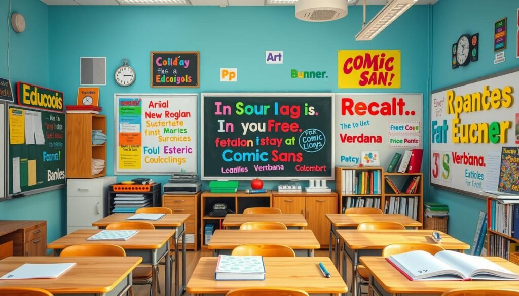
The debate on Comic Sans in schools goes on. But, its use in teaching and benefits for dyslexic readers make it a good choice for classrooms171516.
The Future of Comic Sans Font
Comic Sans font is a big topic in design11. Even though pros might not use it, it’s everywhere and easy to spot11. Its future could be in ironic uses or new fonts that feel like Comic Sans but look better11.
Evolving Trends in Typography
New fonts and styles keep coming out, meeting user needs18. But, some fonts like Comic Sans stick around, becoming part of our culture1. As design rules change, Comic Sans might find a new, meaningful role in design.
Lifespan of Popular Fonts
Many things affect how long a font stays popular, like tech and what people like18. Comic Sans became famous with the rise of desktop publishing11. Even though it looks less sharp now, its fame and cultural value mean it’s here to stay.
Predictions for Comic Sans’ Usage
Comic Sans will likely be used more thoughtfully in the future1. It might be used where its fun vibe fits the brand or message11. New fonts that feel like Comic Sans but look better could also be an option for designers18.
Designers are always talking about Comic Sans’ past and future1. It might not be as popular as before, but its lasting impact and the changing world of fonts keep it interesting11.
Alternatives to Comic Sans Font
Comic Sans is everywhere, but many prefer other fonts for their design. These alternatives offer a casual look with better design. They’re perfect for professional or refined projects.
Friendly Sans Serif Fonts
Craig Rozynski’s Comic Neue is a modern take on Comic Sans19. Comic Parchment mixes Comic Sans and Papyrus for a unique feel19. Andika and Trebuchet MS are legible and friendly sans-serif fonts19.
Modern Casual Typeface Options
Designers have made many modern casual fonts20. Uberhand Pro has a handwritten look with different weights20. Supermarker mimics handwriting better than Comic Sans20.
Fonts like Itim, Kopik, and SideNote offer new takes on casual fonts20. Each has its own style and features20.
When to Choose Alternatives
For professional or refined projects, choose alternatives to Comic Sans21. Fonts like Hollidays and Mandaly add fun without losing design quality21. Hey Lucky! and Jumper are creative alternatives to Comic Sans21.
“Exploring alternative typefaces can provide a fresh perspective and better suit more professional or refined contexts.”
Using these font alternatives, designers can mix Comic Sans’s charm with professional looks. This balance is key for various projects.
Conclusion: The Legacy of Comic Sans Font
Comic Sans has made a big impact on both typography and popular culture. Despite the criticism, it’s widely known and used, leading to debates on font use and design standards. It shows how typography can be both loved and hated.
Summary of Key Points
Comic Sans started as a simple font by Vincent Connare in the 1990s22. It has grown into a cultural icon, used in daily life, education, and even social movements. Its inclusion in Windows 95 and later versions23 made it a common sight for many.
Lasting Influence on Typography
Comic Sans has changed the world of typography. It has inspired new fonts that are easy to read and use. It also showed the need for fonts that help dyslexic readers23, pushing for more inclusive designs.
Personal Reflections on Comic Sans Use
Comic Sans has sparked strong feelings among designers and users22. Some love its playful vibe, while others see it as unprofessional. Our thoughts on Comic Sans show how much typography affects our view of words.
FAQ
What is Comic Sans font?
When was Comic Sans created and how did it come about?
What are the key characteristics of Comic Sans font?
Why is Comic Sans so controversial?
How has Comic Sans been used in professional settings?
What are some best practices for using Comic Sans font?
How has Comic Sans influenced popular culture and typography?
What are some alternatives to Comic Sans font?
Source Links
- Why Comic Sans MS Is A Perfectly Designed Font, Seriously | Adcore Blog – https://www.adcore.com/blog/why-comic-sans-ms-is-a-perfectly-designed-font-seriously/
- Comic Sans – https://fontipedia.fandom.com/wiki/Comic_Sans
- Comic Sans – https://en.wikipedia.org/wiki/Comic_Sans
- The Story Behind Comic Sans – Fonts.com | Fonts.com – https://www.myfonts.com/pages/fontscom-learning-fyti-typefaces-story-of-comic-sans?srsltid=AfmBOoqOQWPzwvYQ6aNj9SUyxzhVV6VcqVBO8YIxFKiXtPiY8WzZuaLo
- The Story Behind Comic Sans – Fonts.com | Fonts.com – https://www.myfonts.com/pages/fontscom-learning-fyti-typefaces-story-of-comic-sans?srsltid=AfmBOorTKxz7He_7V4-Phi8NPG5BD4rCysv9MpkePdnDcoVL604yu1Dk
- Comic Sans: The Font Everyone Loves to Hate – https://www.webfx.com/blog/web-design/comic-sans-the-font-everyone-loves-to-hate/
- The Ugliness of Comic Sans Has a Practical Use – https://lithub.com/the-ugliness-of-comic-sans-has-a-practical-use/
- Why do people hate Comic Sans so much? – https://www.livescience.com/64543-why-people-hate-comic-sans-font.html
- In a Fight with a Woburn Font Company, He Used the Ultimate Burn: Comic Sans – https://www.bostonmagazine.com/news/2019/08/22/comic-sans-font-company/
- The Comic Sans Conundrum: Unveiling the Designer’s Dilemma – https://www.linkedin.com/pulse/comic-sans-conundrum-unveiling-designers-dilemma-ameer-muavia-zuqhf
- Why You Hate Comic Sans – Design for Hackers – https://designforhackers.com/blog/comic-sans-hate/
- Why Comic Sans is a GOOD THING. – https://jamescalmus.medium.com/why-comic-sans-is-a-good-thing-db98d954bec4
- It’s the Most Hated Font in History. Its Backstory Might Change Your Mind. – https://slate.com/culture/2024/10/comic-sans-font-what-is-papyrus-book.html
- Comic Sans Got the Last Laugh – https://www.theatlantic.com/technology/archive/2024/10/comic-sans-debate/680319/
- The Surprising Role of Comic Sans in College Essays Success Stories – https://fontsarena.com/comic-sans-college-essays-the-unexpected-success-stories/
- Comic Sans | Lettica – https://www.lettica.co.uk/blog/comic-sans.html
- Don’t Hate on Comic Sans; It Helps Dyslexic Readers (Asterisk) – https://www.learningandthebrain.com/blog/dont-hate-on-comic-sans-it-helps-dyslexic-readers-asterisk/
- Unpopular opinion: Playlist Script is the new Comic Sans – https://www.linkedin.com/pulse/unpopular-opinion-playlist-script-new-comic-sans-amy-harrison
- Top 5 Alternatives to Comic Sans – Pangram Pangram Foundry – https://pangrampangram.com/blogs/journal/5-alternatives-to-comic-sans
- Alternatives to Comic Sans – Pimp my Type – https://pimpmytype.com/comic-sans/
- 15+ Fonts Similar to Comic Sans, More Models and Styles! – Creatype Studio Co – https://creatypestudio.co/fonts-similar-to-comic-sans/
- Comic Sans: The Typeface with a Polarizing Legacy – https://www.whatfontis.com/blog/comic-sans-the-typeface-with-a-polarizing-legacy/
- English lesson: Comic Sans: the font we love to hate – https://plainenglish.com/lessons/comic-sans/